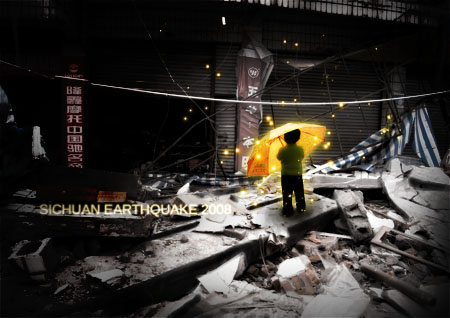
今天图老师小编给大家展示的是四川公益海报特辑,精心挑选的内容希望大家多多支持、多多分享,喜欢就赶紧get哦!
【 tulaoshi.com - 海报设计 】
这个简短的photoshop教程是关于我如何制作四川地震2008照片。当初看到第三届全国大学生广告艺术大赛公益选题信心,觉得这个教程可以给大家一些灵感。教程没有包涵所有的细节。 相反,这篇教程更多的是一种整合的总体影响和制作的图片。如果你有很好的photoshop知识,学习这些应该不太难。如果您有任何疑问,尽管问吧!

这是房屋倒塌的原始照片。

调整对比,特别是饱和。你可以通过色相/饱和度和色阶或曲线调节。

Then place in the boy. I got him from another picture and gave him a mask, removing his former surroundings. Go into layer styles and give him a nice yellow glow. I did the glow by first giving it a white glow on low opacity, then duplicating the layer and giving it a yellow glow on Overlay.接着放置小男孩。我从另外一张图片得到的然后给他一个蒙版,清除掉他的周围剪切不完整的地方。进入图层样式,我给他添加了一个漂亮的黄色光芒。这个光芒我是先给它添加一个低透明度的白色光,然后复制图层给它一个黄色叠加。(翻译有点生硬,有翻译不到位的地方欢迎指出,会及时更新教程)

复制小孩图层,然后进入色相/饱和度,添加上着色的光芒给它一个漂亮的暖黄色调,接着将层的模式设置为叠加。Duplicate the kid again, and go into Hue/Saturation, put on Colorize and give it a nice warm golden tint. Then put that layer on Overlay.
(本文来源于图老师网站,更多请访问http://www.tulaoshi.com/hbsj/)
我又添加一些虚构的阴影带来了一些更加漂亮的对比效果,不需要使图片生辉太多。我是这样做的:简单地用软笔刷在黑色的地区绘制。记住在孩子脚周围画上了一层阴影。I then added in a lot of fake shadows to bring up a nicer contrast where I wanted, without brightening the image too much. I did this by simply painting in black areas with a soft brush. Remember to paint a shadow around the kids feet.

添加灯光。我用一个软笔刷,白色散步的设置。我用白色画了灯光,然后用图层风格给他们一个发光。然后我把图层的透明度设置为25。然后我复制了那个图层,我使用黄色而不是白色填充,然后把层设置为叠加。我再重复的那个图层,并把它放在最上面剩下的没有额外的变化。Adding the lights. I did that by using a soft white brush, with some scatter settings. I painted them in white, then used a layer style to give them a glow. Then I set the layer opacity to 25. Then I duplicated that layer, and instead of white, filled the lights with yellow, and then set the layer to Overlay. I again duplicated that layer, and left it on top of the two others with no additional changes.

然后我在小孩周围添加了一些黑色来创建焦点。我是这样做的直接在黑色的范围绘制,在一个白色的背景上就像这样。Then I added the dark areas around the kid, to create focus. I did this by just painting in dark areas. On a white background, it looks this.

接着我将渐变工具设置为径向渐变(黑色在外部中间透明)在小孩周围创建阴影接着将图层样式设置为叠加。Then I used the gradient tool set to Radiant (with black on the outside, and transparent on the inside) to create a darkening around the kid, and set that layer to Overlay.

最后我给文字添加了一些图层样式,接着viola(中提琴)完成。(尽管决定做什么指出怎样去做当我完成这个图片时花去了我五个小时)Then last I added in the text with a layer style glow on it. And viola, finished. (Though deciding what to do, figuring out how to, composition and more all in all took me around 5 hours when I made the picture.)

本photoshop教程转载于mentalmirage.com/blog 作者Philip Zeplin (原创翻译转载请注明出处并标明链接 多谢)
来源:http://www.tulaoshi.com/n/20160219/1621951.html