只要你有一台电脑或者手机,都能关注图老师为大家精心推荐的超酷纹理网页设计欣赏,手机电脑控们准备好了吗?一起看过来吧!
【 tulaoshi.com - 平面设计 】
How do I create a tile or a pattern?Actually, that’s easier than one might think. For instance, you can use BgPatterns, a free tiled background designer which is basically a pattern library where you can find, create, rate and share patterns. You can select one of 68 images (scrolls, stars, flowers, hearts, signs, trees etc.) as well as pick a color of your tile and the pattern will be generated automatically.

You can also apply some effects (dirty, rugged etc.) and rotate the pattern as you wish. The service has a nifty preview option which enables you to generate your background tiles on the fly, download them or store them.
Here is a compact overview of tiles which have been used on some sites presented below:
 Showcase of tiles and patterns in modern web design
The Paisley Farmhouse uses nicely packaged retro wallpaper tiles as the background image.

Renegade Latino uses dark tiles for the background image. The content should probably be larger.

t!agOliveira uses a hardly recognizable, dark pattern as the background image. The image supports the content and fits to the overall site layout.

Uniquexports uses patterns and tiles for the background image for an online-shop. The pattern resembles a usual (not desktop) wallpaper. The design looks unusual yet attractive and definitely distinctive.
(本文来源于图老师网站,更多请访问http://www.tulaoshi.com/pmsj/)
Noblanco with a background patterns on the left side of the page. The layout is right-aligned for some reason.

General Robots uses stars tiles on both the left and the right side of the centered layout. It is also an online-shop.

Booreiland: any friends of blue, pink and yellow out there?

Warfield.net with a classic wallpaper patterns

and so does Designbyfront: the same theme, a different color.

Falko Seidel with some tiles which one can find in old sweaters or on indoor walls

MiniIcon keeps it to minimal; tiny content area is surrounded by background tiles.

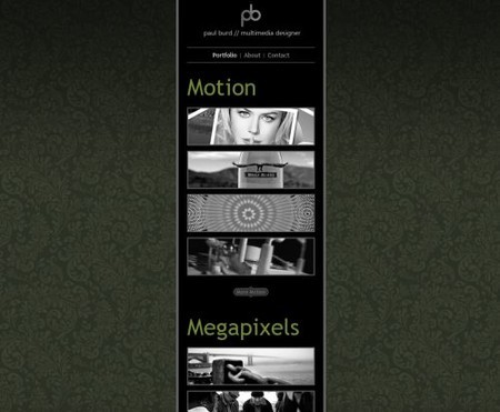
Paul Burd uses the same concept.

Images and TexturesGround
Outdoor Italia uses crumbly pieces of the ground as the background image. Other illustrations on the site fit to the background. The ants on the right hand side of the layout are pretty cool.

Stone and walls
Soyrosa uses vibrant stone stripes as the background image.

Pikaboo.be with hard, strong and dark stone and an unusual vertical scrolling.

来源:http://www.tulaoshi.com/n/20160220/1646527.html