今天给大家分享的是由图老师小编精心为您推荐的Photoshop制作质感的金属立体字,喜欢的朋友可以分享一下,也算是给小编一份支持,大家都不容易啊!
【 tulaoshi.com - PS 】
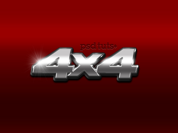
最终效果预览
Tutorial Details
Program: Adobe Photoshop CS3+
Difficulty: Beginner
Estimated Completion Time: 30 Minutes
(本文来源于图老师网站,更多请访问http://www.tulaoshi.com/ps/)Step 1
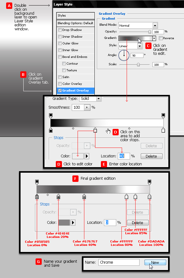
Make a new .PSD document, size 600 x 450 pixels, RGB color, 72 dpi and transparent background. Paint the new layer with black color (press Alt + Backspace key to use the foreground color of PS toolbar). Now we will create a layer style based on a gradient that will include several grey tones, with a bright area to simulate a metallic car door.
新建一个600px × 450px的文档,把背景填充图层填充为黑色。然后创建一个图层样式通过渐变叠加来模拟金属车门的效果。
Step 2
We will add Color Overlay in Multiply Blend mode using color #990000. But we can later give the car the color we wish.
在图层样式里添加颜色叠加,混合模式为正片叠底,色值为#990000。
(本文来源于图老师网站,更多请访问http://www.tulaoshi.com/ps/)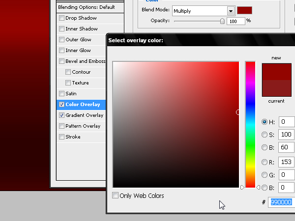
Step 3
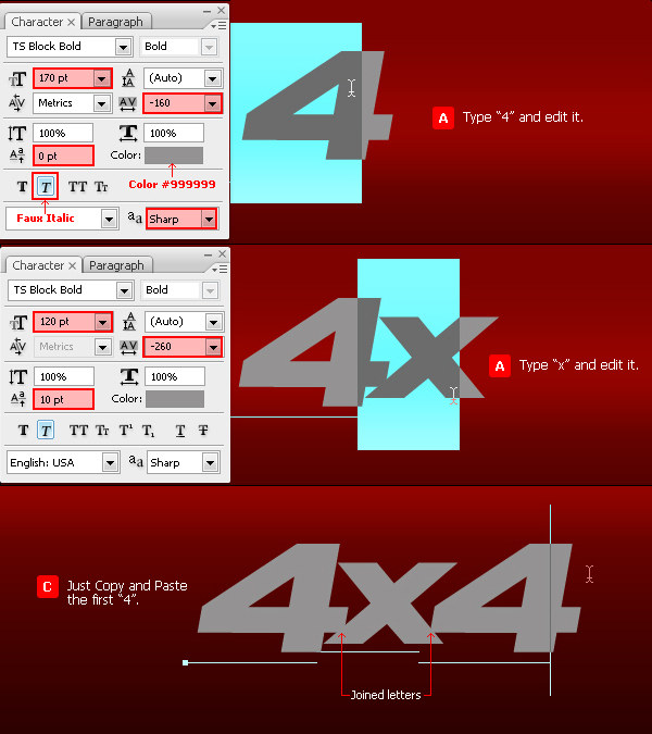
Create some text using an extra bold font in grey color #999999, similar to the ones that are usually used in this kind of motor badges. I have chosen TS Block. Reduce the size of the X as shown and increase the baseline shift in order to join some edges of these 3 letters and give more realism to the fake industrial design. So type 4 with TS Block font and apply some character parameters (see image). Type x and edit it (see image) and then Copy-Paste the first 4 (press Command/Ctrl + C + Command/Ctrl + V) to get 4×4 text.
创建文字图层,作者采用的字体为「TS Block」,色值为#999999。具体参数见图,其中字母X的基线位置向上偏移了10像素。
Step 4
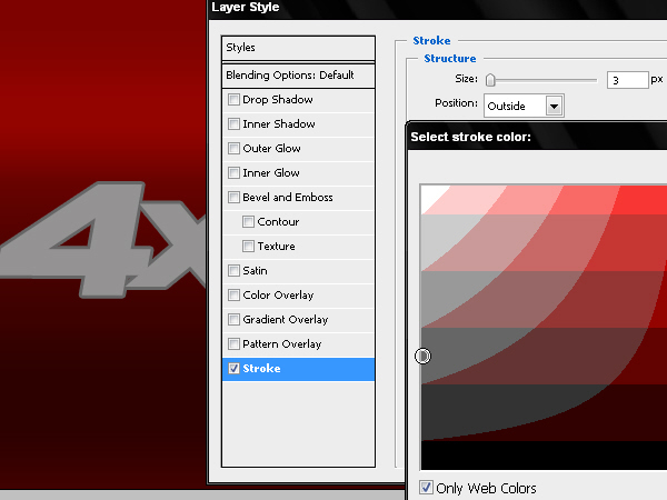
Add a layer style with a 3 pixels Outside Stroke and color #666666.
添加图层样式,外描边,3像素,色值为#666666。
Step 5
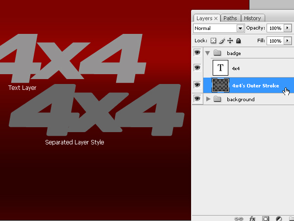
We will separate the stroke style in a new independent layer. To do so we click the mouse’s right button on the fx icon of the layer and then choose the option Create Layer.
在图层样式上右键并选择「创建图层」,以将描边样式分离成一个新图层。

Step 6
Now we have a new layer -with the name of the style we use- and we will add new layer styles to this layer to simulate the badge’s bevel. But first let’s define the style of the front text.
这样我们就得到了两个图层,一个是文字图层,一个是样式图层。我们先对文字图层进行处理。
Step 7
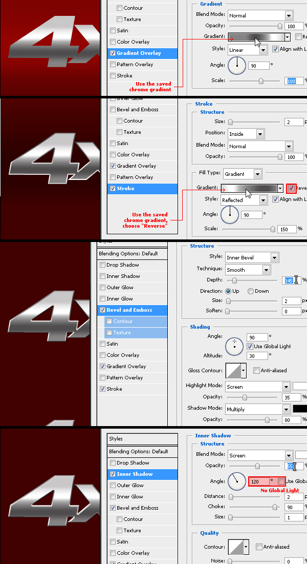
With some values inside the layer styles window we will create the front of the badge. The layer that will work as a pseudo 3D bevel can be seen behind.
对文字图层添加以下图层样式。
Step 8
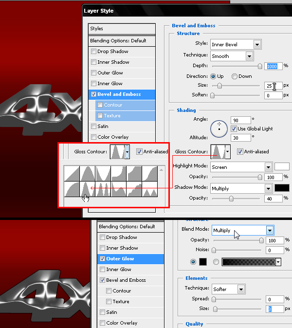
Now we will work on the bevel of this badge with the values for Bevel and Emboss and Outer Glow you can see in this picture. The idea is to add the chrome effect to the bevel of the object. You can choose the angle and color tones that better help you create this effect.
对分离出来的描边图层添加以下图层样式。
Step 9
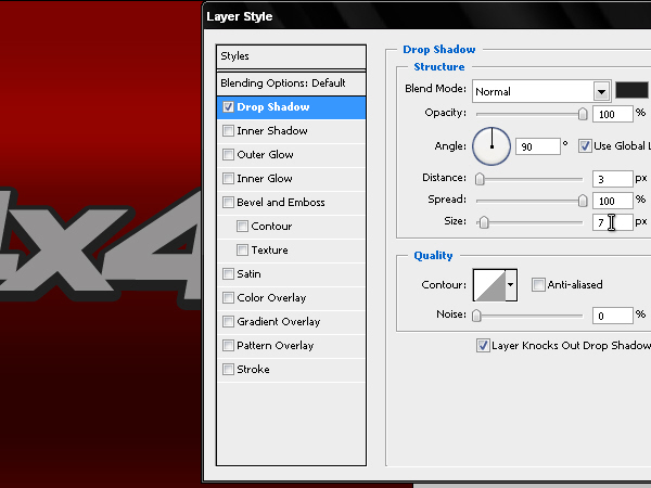
Now we will create the black plastic base that these badges have in the back, which is the area that is stick to the car. Duplicate the text layer and Clear its layer styles. We will use a very hard Drop Shadow little bigger than the text and lightly moved towards down, using color #202020. Repeat Step 05 to separate this style in a new layer.
复制文字图层并将之前创建的图层样式删除,重新添加以下图层样式。然后重复第5步的动作,把图层样式分离到新图层。
Step 10
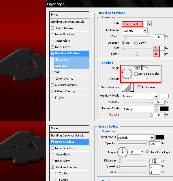
This must create a 3D effect that we will add more layer styles to give some embossed effect to this new element. We will give a Bevel and Emboss effect to this layer as well for it to have a tridimensional look. Then add a Drop Shadow that simulates the shadow of the badge projected on the vehicle.
再对分离出的样式图层添加以下图层样式。
Step 11
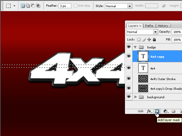
Always using the same editable 4×4 text, we will now create a mask using a selection with a 3 pixels feather.
将第9步复制出的文字图层填充白色,选择矩形选区工具创建如图所示的选区并羽化3个像素,对文字图层添加图层蒙版,如图所示。
Step 12
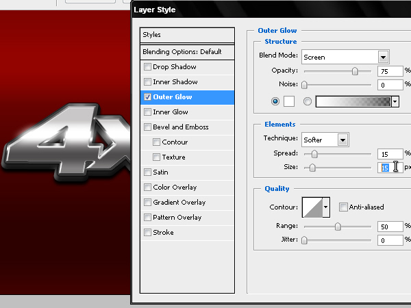
We will add an outer glow effect to this soft masked text in order to simulate the light sparkle that passes through the badge.
对刚才的蒙版文字图层添加以下图层样式。
Step 13
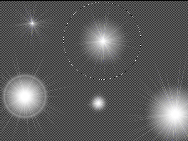
To finish the work we will add a Lens Flare in the edge of the badge. I usually create these effects with a KPT plug-in for Photoshop but I share a download link of a .PNG with a pack of flares of my own collection.
需要给徽章的边缘加上一些镜头光晕,作者在这里分享了他创建的png图片,可以直接使用。
Step 14
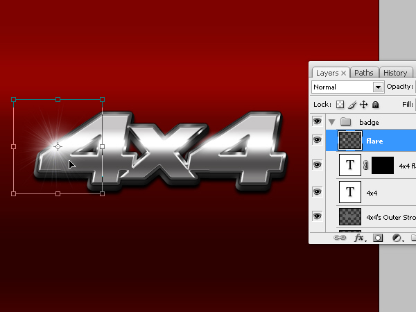
Choose a lens flare FX from the .PNG and copy- paste it into our .PSD file. Edit its size and place it in the left side of the badge, matching it with the passing light Y position.
最后把镜头光晕调整到合适的位置并缩放到合适的尺寸。
Conclusion
You could try with a logo or other fonts. Don’t forget to join the letters or shapes of your work in order to give more realism to your badge. You can view the final image below. Good luck!
最终效果如下。

来源:http://www.tulaoshi.com/n/20160216/1568951.html
看过《Photoshop制作质感的金属立体字》的人还看了以下文章 更多>>